| Situation | What the rule of thirds does | Planning use |
|---|---|---|
| Landscape with dramatic clouds or colours | Horizon sits on the lower third line | Give the sky most of the frame and let the land act as a base. |
| Landscape with intricate textures or leading lines in the foreground | Horizon sits on the top third line | Give the foreground the room, because it is the part worth studying. |
| Portrait | Dominant eye aligns with a top-third intersection | Check the eye position before pressing the shutter, not only when cropping. |
| Subject moving or looking in one direction | Off-centre placement creates lead room in front of the subject | Place the subject on the side opposite the direction of travel or gaze. |
| Scene that depends on symmetry | Centring replaces the grid | Skip the thirds and balance the frame on its middle instead. |
| Reframing after the shot | Grid overlay appears at the cropping stage in editing software | Recompose a drifting frame using the same lines you used in camera. |
Figures and placements in the table come from the Institute of Photographers guide to rule of thirds photo examples and the Visual Education explanation of the rule of thirds.
Rule of thirds examples share one pattern: the frame is split into nine equal parts, and the focal point sits on a line or intersection instead of the centre. Treat it as a guideline, and centre the subject when symmetry is the point.
The sections below show how that plays out in landscape, portrait and street work, and when to leave the grid alone. For wider guidance on picture choices, see our photography tips for blog images.
Landscape examples: where the horizon goes
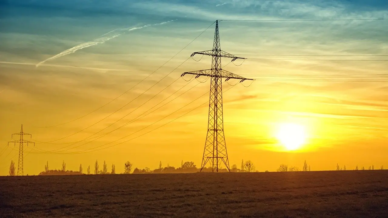
Landscape is where the rule is easiest to see, because the horizon is a long line that has to sit somewhere. The Institute of Photographers gives a clear way to choose: place the horizon on the lower third line if the sky offers dramatic clouds or colours, and align it with the top third if the foreground contains intricate textures or leading lines.
The practical decision is therefore about which half of the picture earns the space. Decide that before you compose, then let the grid line follow.
- Sky as the subject: drop the horizon to the lower third line so clouds or colour fill most of the frame. This suits sunsets and storm light.
- Foreground as the subject: lift the horizon to the top third line so rocks, textured ground or converging paths dominate. This suits scenes where the land carries the interest and the sky is plain.
- Avoid the even split: the same source reports that the painter and engraver John Thomas Smith noted proportions of this kind in landscapes in 1797. He argued that a two-thirds to one-third ratio creates a sense of harmony that a 50/50 split cannot achieve.
When you have a distinct object, such as a single tower, tree or figure, the grid also helps with the focal point. Visual Education advises positioning the most important elements along the lines or at their intersections, so a lone object placed that way is read as the subject while the rest of the frame supports it.
Portrait examples: eyes and space
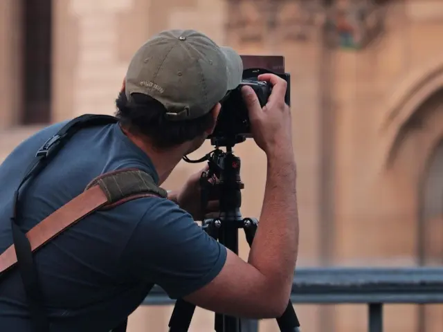
For portraits, the grid gives a simple target: the eyes. The Institute of Photographers recommends aligning the subject’s dominant eye with one of the top-third intersections, and Visual Education makes the same suggestion, positioning the eyes at an intersection for a more compelling portrait.
The reason to work this way is practical. The Institute says this placement fosters a direct, natural connection with the viewer and helps avoid a subject sitting too low in the frame. Eyes on the upper line also leave the rest of the frame for shoulders, hands or context rather than empty headroom.

Gaze direction is the second decision. The Institute advises that if the subject is looking toward the right, you should leave ample space on the right side of the frame. That means the subject is pushed to the opposite side, and the empty area gives the look somewhere to go.
- Tight headshots: prioritise the dominant eye on a top-third intersection, then choose the left or right side to suit the direction of the gaze.
- Looking off-camera: keep the space in front of the face larger than the space behind it.
- Direct gaze: the eye position still works on the grid, but this is also a case where centring can be a legitimate choice (see below).
Street and candid examples: room to move
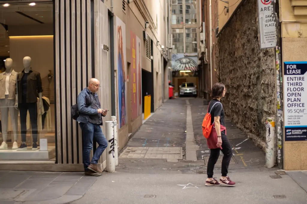
Candid scenes leave little time to measure anything, so the grid works as a quick check rather than a calculation. The Institute of Photographers explains that placing a subject off-centre provides lead room, which is the space in front of a moving or looking subject. A walker or cyclist framed on a side third has visible path ahead of them, while a subject centred with the same movement looks as if it is about to leave the frame.
Visual Education adds that off-centre placement guides the viewer’s eye through the image to the most important parts of the scene. In a busy street, that is the main benefit: the subject sits on a line, and everything else in the frame becomes context for it instead of competing with it.
- Moving subject: put the subject on the side third behind their direction of travel so the frame shows where they are heading.
- Looking subject: apply the same logic to a glance, leaving space in the direction they face.
- Fast moments: get the subject roughly on a line, take the shot, and refine the framing when you edit.
When to break the rule
Break the rule when symmetry is what makes the picture work. Visual Education describes the rule of thirds as a guideline that you are free to follow, adapt or ignore depending on the situation, and says you might choose to centre your subject to create a sense of symmetry.
The decision comes down to what the scene is about:
- Choose thirds when the subject needs context, direction or breathing room, which covers most landscapes, moving subjects and portraits with a sideways look.
- Choose centring when the symmetry itself is the subject, and an off-centre placement would only look like an accident.
- Shoot both when you are unsure. Compare the two on screen and keep the one where the main subject reads fastest.
Centring is a deliberate composition choice. It works best when you commit to it, so make the framing evenly balanced rather than drifting almost to the middle.
How the grid works
The rule of thirds divides an image into thirds both horizontally and vertically, giving a grid of nine equal parts, according to Visual Education. The photographer then places the most important elements along those lines, or at their intersections. Because the focal point sits off-centre, the composition guides the viewer’s eye through the image toward the most important parts of the scene.
That explains the earlier examples. A horizon on a third line, an eye on an intersection and a walker on a side third are all the same move applied to different subjects: the grid gives you a repeatable place to put the thing that matters.
Using the grid in camera and when cropping
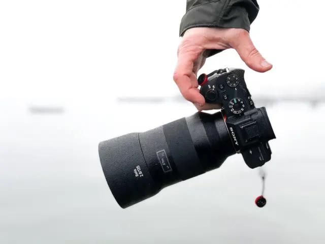
You do not need to imagine the lines. The Institute of Photographers notes that activating the 3×3 grid on a camera gives real-time compositional feedback through the electronic viewfinder. In editing, it says software such as Lightroom and Capture One includes a dedicated shortcut to overlay the grid during the cropping stage.
The best habit is to compose with the grid on, then check it again when cropping. Cropping is a good place to rescue an image that drifted toward the centre, but it should not replace composing carefully. The same institute also publishes curated, annotated examples from diverse genres, including wedding and portraiture, which are useful for studying how the placement choices differ between types of photo.
The same placement thinking applies to commercial images. Our guide to Lifestyle Product Photography: How To Shoot Authentic, Sellable Images In 2026 – Imagesup covers staging products in realistic scenes, and What Is Product Photography? The Essential Guide For Sellers And Marketers (2026) – Imagesup sets out the wider discipline. In both, an off-centre product with room around it is an easy first layout to try.
Frequently asked questions
What are the grid intersections called?
The four points where the grid lines cross are known as “power points” or “crash points”. They are the spots where you place an eye or another key element for emphasis.
Where does the idea come from?
The Institute of Photographers traces its origins to 1797, when the painter and engraver John Thomas Smith described proportions in landscape. Photography later adopted the same logic as a grid.
Does a tilted horizon matter when using thirds?
Yes. Placing the horizon on a third line only works if the line is level, and the Institute of Photographers warns that even a 1-degree tilt can undermine the professional quality of a landscape.